EstreLab is a young agency of co-creation based in Nice that aims to facilitate and accelerate the transition of organizations towards an ecosystemic world through the organization of several activities.
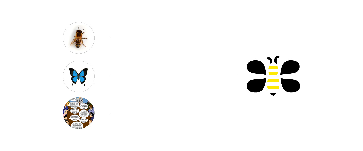
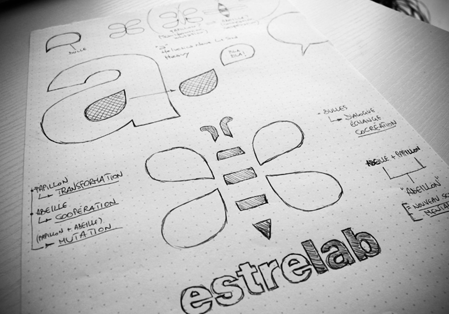
From a general perspective the design of the logo was centered on 3 key concepts related to EstreLab: transformation / cooperation / mutation.
Retaining the fun, positivity and connection with nature, the conceptual requirements laid down in the beginning have led to the choice of a recognizable symbol that can evoke the concepts of transformation and cooperation – in this sense, nature came to help us with two small and precious insects: a bee and a butterfly.
